
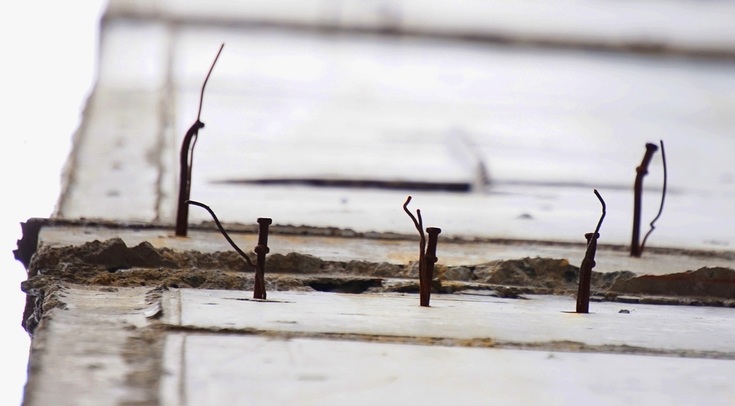
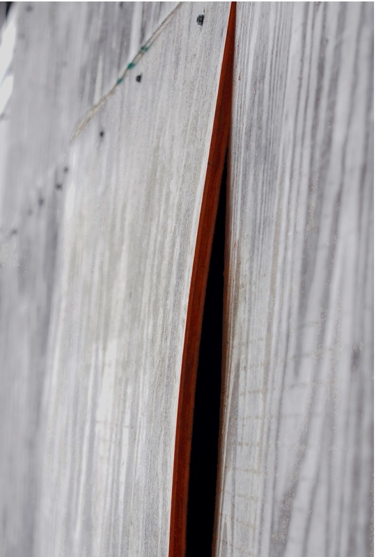
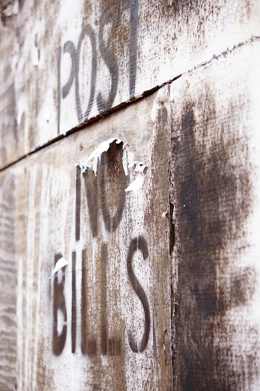
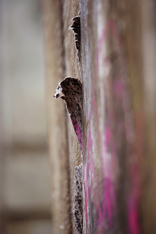
 Like I mentioned yesterday, my work has become more and more intricate and detailed. I needed a bit of a respite from that, so I took a "walkabout" in downtown Charlottesville. There is a building that has been left in a half-built state for about 5 years now. I am not sure of the story, but watching it degrade and change slowly over time is very interesting. I photo it often. I was looking for quiet details. The light was soft, due to clouds and mist. So the colors, if there at all, were soft and muted too. The contrast of the worn or torn with the expanses of flat are very interesting. I am pretty sure that after my work on the lush and colorful nature of Smokey Mountain Park is finished, something like the simplicity found in these photos will be the basis of my next series.
1 Comment
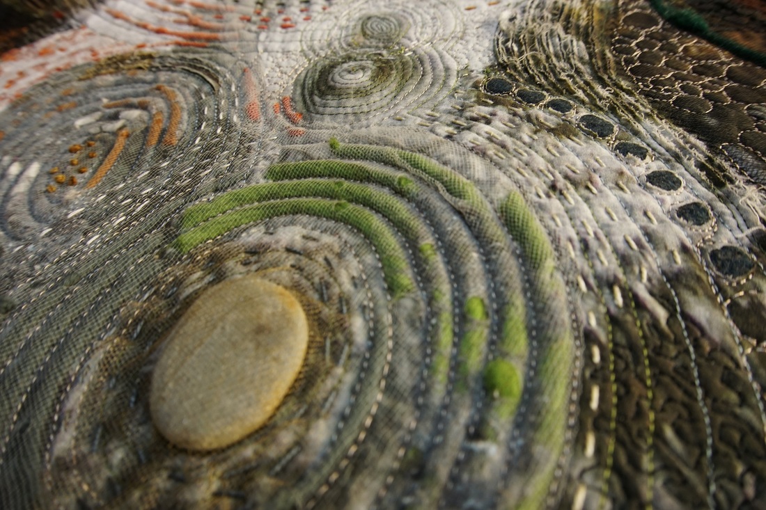
 The pieces I am working on now for my February show are getting pretty intricate. There is stitching, cutting, couching, beading, and more stitching. I have been thrilled with the pieces so far, but yesterday something started to tickle my brain.... When exactly does intricacy turn into obsession? When will I know if have crossed that line? Well after few hours of pondering and I came to a conclusion, or test: If the ART WORK NEEDS the element or treatment to complete the composition or statement, then it is intricacy. If I HAVE A NEED to do the treatment or put on another element to support some inner itch, then it is obsession! I am not sure I will always be able to tell the difference (after all, that creative itch is awful close to the obsessive itch!) but this does remind me to stop frequently and take serious stock in what is going on as I work.
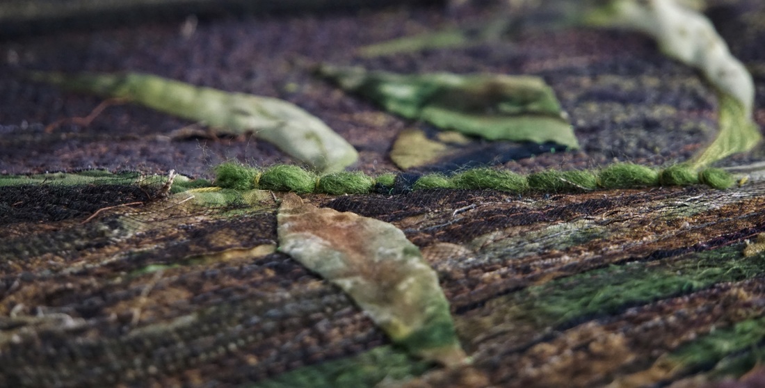
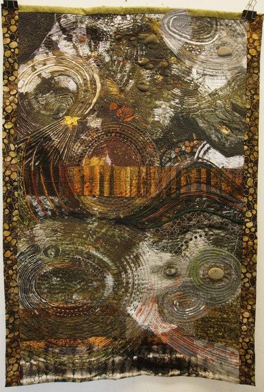
Working in my studio at the Art Center, has been so good for this type of reflection. There is art work - finished and in progress - everywhere. I stop. I look. I silently critique... and then I am set to critique my own work. There are artists everywhere. I have discussions about color or style, or other "artsy" things that may have been back-shelved in my brain for a while. They get dusted off and reexamined. There is time and space. My work can sit out over night while I ponder. My ideas can be posted on the walls for slow infusion into my brain. My previous work is at hand to pull out and remind me of things that were (or weren't) successful in the past. Am I making this sound idyllic? Well it is. So far so good. I can already see the effect having the art, the artists, and the time and space is having on my work. I am grateful and excited. 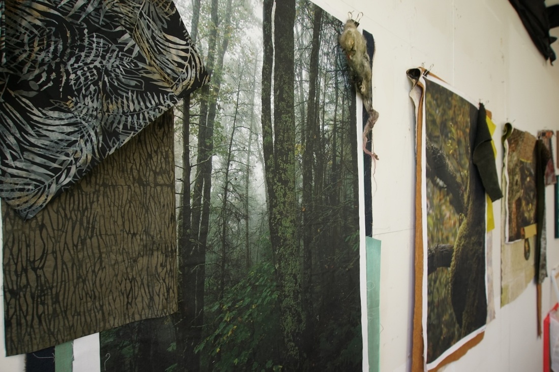 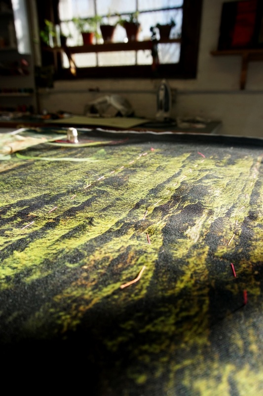 For the month of February, 2016, I will be having a show at the McGuffey Art Center in Charlottesville VA. The show will be mostly the work inspired by my Smoky Mountain National Park artist residency this past October (to see all my posts about that experience click "Locale: Smoky Mountain Residency" in the Categories) The above photo show the start of some of the larger pieces. I have had my photos printed on fabric, then I start "auditioning" additional fabrics, fleece, and embellishments to go with each one. I am hoping to have about a dozen pieces finished for the show, as well as also showing some of the photography on its own. The pieces will range in sizes from small, 10x12, to 50+ inches. I have a few of them done, but it will be a very busy January for me! One of the benefits of my new studio is the number of people with whom I get to talk about art each day. Some are the other artists, some are visitors, and even a few patron customers! For some this might be an interruption, but for me it is invigorating. I am not a good self-reflecting ponderer. I do much better thinking out loud while discussing and explaining. As I have these discussions, I think more deeply about my motives and process. They are helping me realize more and more about 'why photo?' and 'why fiber?' (I will try to blog about that sometime soon) I will try to keep you updated on the progress, but if you don't hear from me it is because I am under a pile of thread and fabric! Jill Jensen will be showing at the same time, so it is a "twofer" for fiber art! I am so excited to show along side of her. She is one of the wonderful fiber artists whom I have met since moving to Virginia, and who have made this move so inspiring.
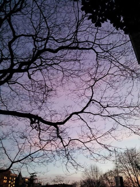 There has been a lot of chatter on the internet about Pantone's announcement of the new colors for 2016; "Rose Quartz" and "Serenity". To me and many others those colors hearken back to either baby shower wrapping papers or the geese, hearts, and ribbon decor of the eighties. Neither of which do I need to re-experience! In one day there were several posting of sun sets or rises similar to this one that I took. Each poster noted the similarity of the colors to the ones that were forecast... maybe it was late in the day, the Pantone folks were tire and wanted to move on to cocktail hour, so they choose what they saw out the window! The discussion reminds me of a conference I went to years ago, and I thought you might be interested in an insiders look at how some of this forecasting happens. The group I belonged to was the Color Marketing Group. This is an international group that is made up of creatives and product developers from many industries including auto, fashion, home decor, paint, flooring, etc.
If you think about it when you go to remodel your house, you want to know that there will be paints that will match your sofa and carpeting and window coverings (the industry I was involved with) . When you go purchase your car, it is nice if the seat upholstery color is in the same family as the carpet and the exterior. But all of these are made by different manufacturers so how does that happen? At this annual meeting, we all brought three groups of information. First was the sales history, broken down many ways, of the colors that were selling now. Secondly, we brought information and samples of items that we were looking to release in the next season or two. Thirdly, we brought information and supportive evidence about colors and ideas we were just starting to look at now for use in few years hence. We then got into groups of related industries to go over this information. The discussion were not just about color. They also took into account finishes (shiny, matte, metallic, etc), materials (natural vs. plastics, new technologies, etc) and processes. It was so very interesting AND I could see where this coordination is also necessary. If the lighting industry started focusing on bright blue metals, while the carpet industry was doing something totally out of sync with that, neither would sell much. Cohesively designing a car with parts from so many industries would be impossible. After days of discussions, opinions, facts, looking at the economy and trends, we developed color boards using the results of these discussions. The CMG committees would then compile this information, organize it and disseminate it to their membership. This information was just that; informative. It was not dictate of what any industry should or shouldn't do, but instead was cross-industry information that they could choose to apply as much or as little to their own product design as they felt was appropriate. Many just used it as a check and balance system against their own conclusions. It was an interesting process, and on many levels an extremely productive one. The final color recommendations were certainly not always on target but they did suggest directions. Next time you go into a store and can not longer find that royal blue you loved three years age, or suddenly the store seems awash in an orange you never thought you would wear or see again.... this is why! But if you can't find that royal blue, just go to Goodwill, and you will probably find loads of the colors that were popular a few years ago! 
|
Categories
All
Archives
January 2022
If you are really into history, click here for blog posts prior to 2014 !
|


 RSS Feed
|
© 2024 Jill Kerttula..
All rights reserved |
|
HOME |
ARTWORKS
|
CONTACT & ARTIST INFO |
|